Banner Gallery
Here
you can check out the old Can of Nothing banners! They're not all that great,
but I had some fun playing around in Photoshop back then. They are shown in
the order in which they were released.
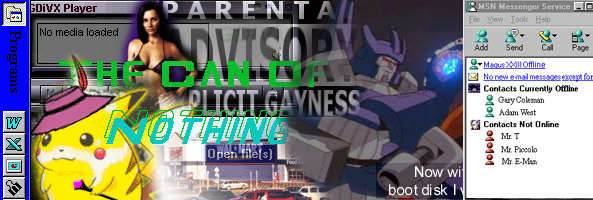
This was the cheap "Done in 10 minutes" banner I made. You can tell I put so much effort into it! I just took a bunch of images and desktop screenshots and blended them together using the eraser tool. It was definitely a rushed job, but seeing as how it was made the same morning Majin and I decided to create the site, and we didn't really intend to make the site anything great, it really fits.
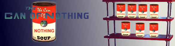
With this next banner I got a bit more creative, as you can see. I believe I was doing an assignment for one of my classes, and I needed to get pictures of furniture as part of some kind of advertisement. I ended up with this picture of the shelves, and it gave me the idea to put cans on it! I must say it turned out quite well, and I really like it, except for the blurriness around each can. Really, though, not to sound big headed, but this idea was amazing. You see cans on shelves at stores, a lot of people put them on shelves in cabinets and all that...so why not do that here? I rock. Really, I do.
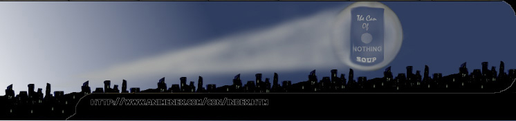
This banner may look weird to you because of the left side, but there's a reason for that. It was made to connect to the menu bar. I saw it done on a few sites and thought it looked cool, so I tried it out for myself. I drew the city with the pencil tool, and kept copying and pasting it along the length of the banner. Obviously I copied the Bat signal for the can part...poorly. It looks like a moon shooting some weird beam. Like most of my Photoshop work, I did this with the eraser tool! I think the can turned out nice, though. Looks cool. If you haven't noticed, this banner was used on menu bar of the current site.
(Click
banner for full size) I'm
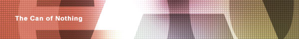
not really sure what I was doing with this banner. I kind of made it to work
with the way the rest of the page layout, and needed it to stretch the full
length of the page, so it's longer than all the others. I just did weird things
with the filters for the strange "effects" you see there. I don't know
what I did with the squarish black stuff, but the others were pretty much just
the official Can of Nothing can motion blurred like there's no tomorrow. Same
with the text. And then, don't ask me why, I added in the Chu Chu Rocket cat and
mouse. It looked weird, I guess, so I did it.
This banner was made by my friend Richard for the site that was hosted on the free account at Brinkster. It's the only banner that was actually made flashily, because Richard knows how to use those graphics programs. Not much else I can say about this since I didn't make it.
![]()
This is the logo we used since we started paying for web space and domains. So it's been around for a couple of years now. I have no idea why it's so simple. I planned on sticking a lot more on the blue bar at first, but I just put Buckethead for some reason. Most of the text was stolen from other sources. "The" was from the large banner two banners up on this page; "of" was from a Transformers logo; and "Nothing" was a mix of a Pink Floyd logo and an Opeth logo. "Can" I obviously wrote in myself.
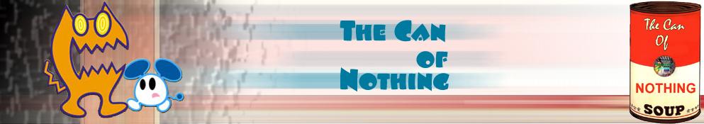
And now we have the current logo you see! I finally got around to putting stuff on the bar, and I went with characters from our movies! I really like this one. Lots of colours, and the background Derek put works well with it.